Website and trust
ProblemConsistent branding makes every touchpoint feel more trustworthy: the website, review asks, social posts, quotes, invoices, and follow-up messages. Start hereConsistency beats constant redesign
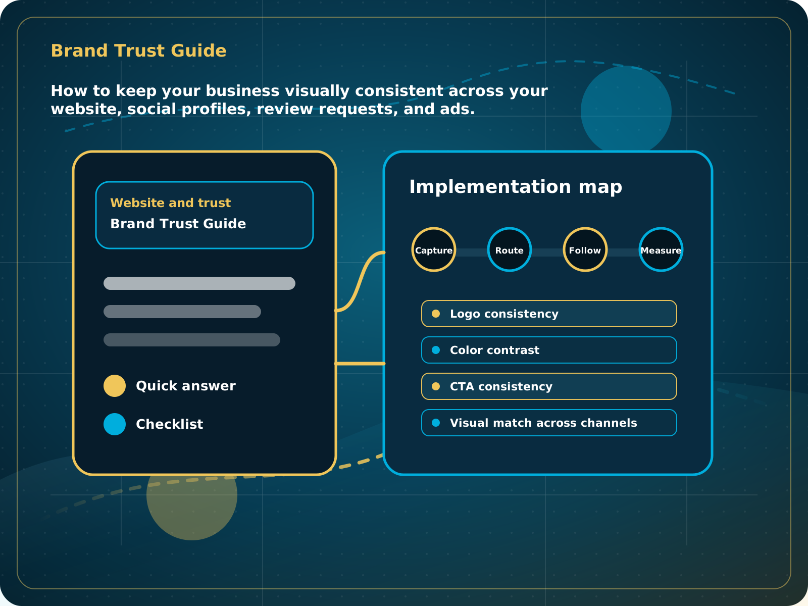
Brand Trust Guide
How to keep your business visually consistent across your website, social profiles, review requests, and ads.
Leads capturedConnected
AI responseConnected
Reviews requestedConnected
Follow-up sentConnected
Branding and Colors Guide
The business looks consistent, readable, and professional everywhere a buyer checks before contacting.
Practical starting point
1Choose the primary logo 2Define a small color system 3Set readable type rules 4Standardize business facts
Consistency beats constant redesign
Gather the approved logo files, colors, fonts, business name, phone, website, and short business description before updating public pages. The goal is recognition and trust, not adding more visual effects.
Keep one approved full logo and one simple icon or mark. Do not stretch, recolor, crop, or add effects to the logo.
Use one dark foundation, one light background, one readable text color, and one accent color for important actions.
Use one heading family and one body family when possible. Make body copy easy to read on phones and keep contrast strong.
Use the same business name, phone, website, service area, and core description across the website, Google, Facebook, directories, and documents.
How to keep your business visually consistent across your website, social profiles, review requests, and ads.
Quick answer: Branding should make the business easier to recognize and trust. Keep colors, logo usage, typography, offers, and proof consistent across the website, social profiles, review requests, and follow-up.
What to know first
Consistent branding makes every touchpoint feel more trustworthy: the website, review asks, social posts, quotes, invoices, and follow-up messages.
Keep this checklist nearby
- Use one primary logo system
- Keep colors consistent across pages and social posts
- Use readable contrast
- Match CTA language to the buying action
- Keep proof sections visually consistent
Step by step
Put this into practice.
Use the steps in order the first time. Once the process is working, keep the parts your business actually needs and review them on a simple schedule.
Choose the primary logo
Keep one approved full logo and one simple icon or mark. Do not stretch, recolor, crop, or add effects to the logo.
Define a small color system
Use one dark foundation, one light background, one readable text color, and one accent color for important actions.
Set readable type rules
Use one heading family and one body family when possible. Make body copy easy to read on phones and keep contrast strong.
Standardize business facts
Use the same business name, phone, website, service area, and core description across the website, Google, Facebook, directories, and documents.
Create reusable proof layouts
Use a consistent style for reviews, before-and-after images, project photos, team introductions, and offer graphics.
Audit the customer path
Check the website, social pages, quotes, invoices, emails, and review requests. They should feel like the same business without looking copied and pasted.
Common mistakes to avoid
- Stretching or changing the logo
- Using too many colors
- Making text hard to read
- Changing tone from platform to platform
What to measure
- Logo consistency
- Color contrast
- CTA consistency
- Visual match across channels
- Trust section clarity
When this is working
The business looks consistent, readable, and professional everywhere a buyer checks before contacting.
How Lead Media Solutions connects this
Premium SEO Website is the deeper route when brand consistency needs to extend into a custom authority website.
Use this guide when preparing logos, colors, and photos for LMS setup. Correct source files help the website, review widget, social planner, and customer messages look consistent from the start.
Best next step
Use Premium SEO Website when the brand needs a deeper custom web presence.
Related starting points
Choose the offer by the actual problem.
AI Receptionist
The business has a response-speed problem.
Test the AIFoundation System
The business has a trust and social proof problem.
Start Foundation SystemBusiness Essentials
The business needs the core operating system.
See Business EssentialsBusiness Essentials
Start with the 15+ page CRM-connected website inside Business Essentials.
Build the Core SystemGuide FAQ
Answer-focused summary.
What is the main point of the Branding and Colors Guide?
Branding should make the business easier to recognize and trust. Keep colors, logo usage, typography, offers, and proof consistent across the website, social profiles, review requests, and follow-up.
Where should I start?
Gather the approved logo files, colors, fonts, business name, phone, website, and short business description before updating public pages. The goal is recognition and trust, not adding more visual effects.
Can Lead Media Solutions help implement this?
Yes. Use this guide when preparing logos, colors, and photos for LMS setup. Correct source files help the website, review widget, social planner, and customer messages look consistent from the start.
Where can active LMS clients get platform instructions?
Use the Lead Media Solutions Help Center for current button-by-button platform walkthroughs. This guide explains the business process and best-practice setup around those tools.